Queen Anne Victorians. I love them. I love the colorful, showy, over-the-top exuberance of them. I love the whole "more is more" mind set. Let's face it, Queen Annes are the drag queens of the architecture world, and girl, they are fab-u-lous. They are also what most people think of when they hear the generic term Victorian. So, even though there are lots of different styles of Victorians, for the purpose of this class I am really thinking of Queen Anne when I use the general term Victorian.

The things that make us love Victorians also make us scared to try to build them. There is a lot going on there and it can be a little intimidating. If I had a dollar for every time I have heard someone tell me " I cant do Victorians" I would have....well....a bunch of money. So wipe that thought from your mind because you CAN do a Victorian. Trust me. It is just a matter of putting the parts together and I am going to walk you though it. This class is going to cover a lot of information because I want to walk you through the whole process step by step. Work at your own pace. If you have any questions, let me know...and include a picture or two if you can....or if it applies. Ready? Let's dive in.

The trick to putting together a Victorian is this: think of it as the puzzle that it really is. Victorians are actually a large mass of smaller parts all put together: porches, turrets, bay windows and bump outs all working together to make a single unit. And like any puzzle, you have to take your time and figure out how the parts fit together.
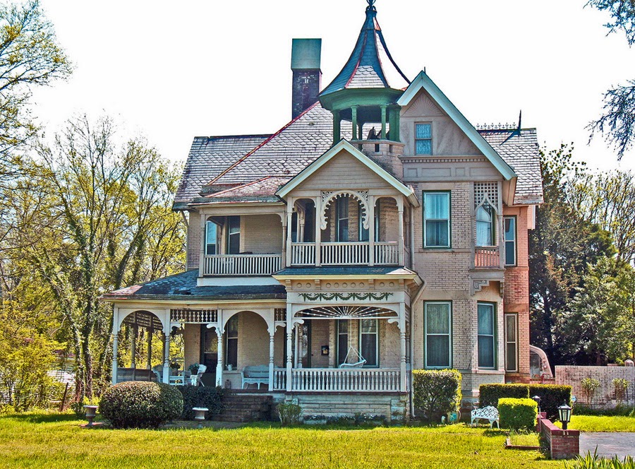
One of the first things to do is to Google "Victorian House" or "Victorian architecture" and start looking at images. The idea is not to try to copy something exactly...the idea is to find something you like and then to use some of those elements in your own construction. Notice how even though these houses are large...they are actually broken up into bits...parts poking out here...poking up there...not a solid mass at all. That is important.
If we take a Victorian and remove the roofs...like this:
You can really see how it is just a bunch of shapes fitted together...kind of like a puzzle. And the parts are not that big. This is one of the most important concepts. Start thinking SMALL. One of the biggest problems people have with making Victorians is letting the size get the better of them. When you have large hunks of house the shape becomes blurry. Big, room sized turrets, large additions...all of these things might create more room on the inside of the house, but at the expense of the look.

Looking at the above example, I hope you can see how it just feels "wrong". It has some Victorian elements and it does have parts poking out here and there and a turret....but all of those parts are too big. It is as if the shape as been pulled out of focus and distorted. So rule number one of making a Victorian is to start with smaller puzzle pieces. To that end, let's start with our main section. And let's keep it narrow: no bigger than 6 squares across. I am going to keep the build lines visible in these images so that you can copy along if you would like.
This will be our main building block.
Before we get going, we are going to want to add a basic porch and then check and see how the house sits on the lot. Is it to close to the street? Too far away? Now is the time to move it while we can. ( and yes...in The Sims 4 this will no longer be an issue...yay!)
The next thing to do is start adding some parts...the poking out bits and parts. A turret, perhaps? Everyone likes a good turret. And the secret to a good turret is? That's right....SMALL. Get over the idea of a turret as being a room...a bathroom perhaps, but that is it. If you make a turret large enough to be a room, it is going to look like a water tower and be way to huge for the rest of your house. Even making a turret 2 squares on each side...just 2 squares....is too much.
This turret is as big as the main section of the house. You might be looking at it and thinking it doesn't look too bad..so let's go ahead and add some roofing so we can get a better look. First add a roof to the main body. For additional tips on roofing specifically, check out my Zoo U course " Roofing 101" which can be found
HERE
The size and angle of a roof is proportional to the space it is covering. Sounds like a geometry theorem or something, but the bottom line is that the bigger an area you are trying to roof...the steeper the pitch....as in the illustration above. Leaving it like that will make the roof over-dominate the structure and we don't want that. The solution is to do the roof in sections. For now, lets do the front section...like this:
We can then cover the rear section with another roof. You might be noticing that sloppy edge under the eaves. That kind of thing drives me crazy! We will cover that up later once we are done adding all of the parts of the house. Worst case scenario: a nicely placed chimney will neaten that edge right up.
Now, back to the turret. Draw a roof by placing the roof tool on one of the corners and drawing a diagonal to the opposite point. That will center the roof. As you can see, even with roofing on, our turret is too big. It should not be as big as the main section of the house.
Make the turret one square on each side. It should look like this. Since we want to avoid everything being on the same plane, it is important to place the turret so that the flat front of it is NOT on the same plane as the front of the house. You can place it in one in front or a few back...just not equal to the front.
While we are at it, let's go ahead and make the tower one level higher than the main body of the house, because what we are aiming for is a rhythm in the silhouette...some parts higher than others, some parts sticking out and some receding. What we don't want is everything on the same level.
I find when I am at this stage that it is best to draw out a large foundation and not worry about "trimming" it to match the shape of the house yet. We don't know how much will be needed for porches or other elements, so there is no sense fussing with getting the edges of the foundation to match the structure at this point. We can neaten things up later when we know what the final shape will be.
Now that we have something on the left side of the house, we want to balance it out by placing another puzzle piece on the right hand side. This could be another turret, if we want, or perhaps just another section of house. As with the turret, it is important that we either indent or extend this section to keep the front of the house from looking like one solid blob.
This section needs to be two two levels high....because it will give the shape balance and also because we want enough room upstairs for more than one bedroom. Let's add a second level to this.
We are going to indent one square. I hope you are noticing a trend on this: every time we add something...add a section or chunk to the house we are going to indent it a little or make it stick out a little to keep the shape from being flat. Also, by indenting all around on the second story, when you add the roofing, the seams line up nicely the the edge of the house like so:
That gives your roofing a neater and more polished appearance. Go ahead and draw in a roof for the top section too.
Now let's step back and see what we have so far. We want to look for shape and balance.
At this point, you might be worried about the overall size of the house. I said small is good, but you might be worried if there will be enough room inside for everything you want. That is a legitimate concern. One thing we can do to add some extra room is to add some space on the back and sides of the house. As long as we don't extend beyond the edges of the facade or front section of the house, these parts will not show and will not mess up the balance of our shape at all. Here is what I mean by that:
On the right side, at least one square behind the farthest edge we can add a whole other section like so. For now, lets keep that just one level. We could play around with making it two...always looking at the front of the house to see how we are changing the appearance, but for now..this might be good enough.
On the other side, we don't have much to work with if we don't want it to show beyond the edge of the turret, but there is room to add a little more. To keep the roof line neat, I am only going to extend this section as far back as where that roof starts. When we roof that section it blends together nicely:
Back to the front of the house to see what puzzle piece we need to add next.
The front feels a bit flat so lets add some depth with a box window. These look best when they are either one or two squares wide...more than that and they can seem top heavy. Lets center this one on the doorway. Why aren't we using one of the box windows that come in the window section? Because of this:
Not only does it cut into the roof line in an unattractive way, it really is not in proportion to our structure. If you find that one of these windows does work on your house, go for it....but if it doesn't, don't be afraid to make your own!
Back to considering the shape of the house. To my eye, it seems like this area here is missing something. Perhaps we need something vertical here to balance out the turret? Might be a great spot for a chimney, right? Or...we could add another turret. Turrets are like mushrooms...they can sprout out from anywhere. So lets see how one might look here. Make sure you have placed some flooring under the roof to make it easier to see where you are drawing and lets see what happens....
Ugh! That doesn't work at all, does it? Too stumpy. Maybe we need to add another level? Try that.
Meh. Better but.....now that tower really dominates the structure and kind of overwhelms everything, don't you think? What is the solution? Sometimes when you need a little extra height but not tons, the "placefriezes" cheat comes in handy. First, make sure you are not in the foundation section of the build catalog. Then open your cheat box and type in "placefriezes on" and then go into the foundation section and you can add a "foundation" on top of the walls, like so.
When you are done, don't forget to go back in and type "placefriezes off", once again making sure you are not in the foundation section of the build catalog when you do it. Let's see if that is the height we need for our composition.
Feels balanced to me. For now, I think we can leave it where it is and start to tackle the porches. Because, yes...we need some porches. Scroll back up to the start of the class and look at those real life examples I showed you. Every single one of them has a porch...or two...or three.
Porches require balance. We need them big enough that the sims can actually use them but we don't want them too big/deep or they (and the resulting roof) will totally overpower the house. I find that 2 or three squares deep is the best size for a porch. If you go deeper, here is the result:
Yikes! That is way too much porch roof. It ruins the whole front of the house. On the other hand...if you only go 2 squares deep you might have routing issues on the front door.
Between the space needed for the top of the stair and the space needed for the door, there is not much left over for sims to move around, is there? Luckily, no one ever said a porch has to be the same depth all the way across. ( and if they did...well...they are just wrong!)
We can make just the area in front of the door deeper without turning the whole porch into a giant monstrosity. This is one of my favorite tips...it gives you good routing room plus it makes the front of your house interesting. Try extending the porch like in the image above. The indention gives you a place for the stairs and will give your porch a polished look.
Now that we have the front porch done, lets work our way around the side of the house. I know the turret might be making you a bit worried. If we didn't have that sloppy edge of roofing to cover, and adding a porch for the turret seemed overwhelming, we could skip the roofing and just make a flat balcony around the turret....like this:
But we DO have that sloppy edge to cover...and I want to show you how easy it is to add a porch around a turret. Just draw a roof on the first floor and extend it out beyond the edge of the wall. So you know where to start drawing the roof, place the fencing that will follow the edge of the roof like so. If you want your sim to be able to actually walk around the porch, you will need to make sure there is at least one full square all way around.
Draw the roof and check it from the front to be sure it is centered. If you go from one corner to the opposite diagonal, it should be centered. On a turret that is 1 square on each side, the roof you draw will be 5x5 if you have left enough space on the porch. You can adjust the pitch of the roof to bring it down the the same level as the front porch. This will connect everything together.
As long as we are here, let's go ahead and clean up the edge on the foundation by trimming off the extra to bring it flush with the porch edge. Once that is done, continue working around the side of the house.
As you can see, if we continue the line we started with the turret porch, we are going to end up with a 4 square deep porch on the side. And since we already know that a porch that deep makes a freaky looking roof line, we need to resolve this another way. Wrap around porches don't have to wrap all the way around. If you ever find yourself in a situation like this, you can break it up into two different porches.
Just make sure that there is enough room between the two stair cases, as in the picture above. This area will make a great place for a patio once we are ready to landscape. Add the roofing to finish the porches.
Go back to the front of the house and lets check our work and see how things are shaping up....making sure to add the fencing to the front porch area.
You might decide at this point that it looks "done" and move on to adding windows and wall coverings. And I would agree with that. Or, you might look at what you have put together and be concerned that there is not going to be enough room inside for everything you want to include. I could understand that too. Once you get to this point here....where you have a decent shape you are happy with, but you might want to keep working on it....SAVE. Save your work in your library so you can always come back to this version. Once we have that save tucked away, we can go ahead and see about messing around more with the shape of the house.
Basically, we are going to just push and pull at the shape until we decide we are happy with the results. If we want to make this wing bigger, for instance, we could pull it out a little...and make it a bit fatter too.
To compensate for the larger area we have created, we might want to add another box window on the first floor. See how it breaks up the roof line and adds some interest? but perhaps now that second turret we added isn't working so much any more. Notice how most of the weight on the house is on the left side because of the second turret? Perhaps we need to get rid of it.
Replacing it with another vertical element, like a chimney, allows us to scoot it over and create a better balance for our construction. I prefer to make my own chimney and then use the "move objects on" cheat on the fireplace to remove the chimney the game draws for me....mostly because that nasty orange brick usually does not go with the rest of the exterior. And since we cant CASt chimneys....( I know...don't get me started!)
Once again, step back and check your work. Here I felt like the extra room we added was a little too much, so I brought it in a square. To me, this doesn't feel perfect, but it works...and it does have more space. You might be tempted to finish the exterior...but before we add windows, need to know where the rooms are going to be. We want to make sure there is a window in every room and that a wall doesn't bisect a window. So no windows until we take care of the interior walls.
Take a look inside and demolish all of the interior walls so you have a nice blank space to work with. Place flooring on each level so you can see what you have and then take a deep breath. Its time to divide up the space and hope that the exterior shape we have drawn will split out into decent rooms. Sometimes it doesn't and you have to go back to the exterior and try a different shape. Most of the time, it does.
The very first thing you have to do is figure out where the stairs are going. Easier said than done. Always allow 2 squares at the bottom and top of stairs minimum for decent routing. You also want to be aware of the way that the staircase is breaking up the space inside the house. For example, if you decide to place the stairs in the middle of the first floor you would get something like this:
The turret area makes a nice first floor bathroom ( it is always a good idea to have a bathroom on each floor) and the back area will be a nice kitchen/dining area. But does it work upstairs too?
Nope. It doesn't work at all. Look how the stairwell cuts up that space to the right. No matter how you divide up the rest of the space, that stairwell will always cut into that space and create a choke point for routing. Not good. Let's try again.
I still like the idea of the turret area being a downstairs bath...and if we move the stairs over to the side, there is still room to allow for a doorway to that space. The whole rest of the downstairs can be divided any way we want. This looks promising. Better check upstairs....
Nope. This does not work either. It completely ruins the space to the left of the stairs...we cant use it for anything...and even as a sitting area it would be a problem because of the one square choke point created at the top of the stair. That is just asking for routing issues...which we do not want. So back downstairs to try again.
This placement gives us a bathroom, a nice sized kitchen/dining room area, and a large family room. There are two squares at the base of the stairs. So far, so good.
We might be on to something! There are two squares at the top of the stairs and some nice big hunks of space to work with too. Try dividing it up.
Yes. This will work nicely. There is plenty of room for 3 bedrooms and a bathroom, or perhaps 2 bedrooms and a study/work room of some kind. Still need more space? Don't forget that you can always add a garage with a huge basement! For this house and this shape, we have a decent floor plan. Whew!
Now we can add the windows.
You don't have to use the same windows for the whole house. Special features deserve their own special window. The box windows we created are the perfect example. Give them something dressy.
Next, start working on the rest of the front. What looks best here will decide what we use everywhere else. You may have to try a few styles until you find something that feels right and looks in balance with the shapes. These long thin windows fit...theoretically...but they just don't feel right to me. They don't leave any space above or below them and it reads more modern to my eye. So off they go....for something a little more traditional.

These windows seem more in proportion to the house. I like using the ones with window boxes on the second story and the plainer ones on the first floor, but you can do whatever you like. Try not to use too many different styles of windows, though. First, it makes the exterior look too busy. Secondly, and perhaps more importantly, there are very few curtains that fit multiple windows ( I know...don't get me started!) so you truly want to avoid having a bunch of different windows in the same room...because then you will have a bunch of different curtain styles in the same room and that just looks...weird.

Another note about window placement: Not every spare inch has to be covered in windows. Here to the right of the box window, it seems like it might be a good spot for a window...but it really makes that area look too busy. Turrets are the same way. Not every wall on every level of a turret has to have a window. Add windows to the front of the house and pull back to check how things look overall. Then pick the most predominant window and use it for the sides and back of the house.
Pay attention to window placement. Try to ensure that things look nice and balanced from the exterior while checking on the interior to ensure that you are not placing them in a bad spot. If you can, try to echo patterns from the bottom floor to the top to give your exterior a unified look.
Windows and doors all done. Check. I like to finish the exterior before I work on the interior. And since we are talking about Victorian styles, there is still a bit of work to do on the exterior. One of the most distinctive things about Victorians is the exterior paint finishes...the whole "painted lady" effect. Not exactly historically accurate, but who cares? It looks good!

Picking a color scheme can be a lot of fun or torture, depending on how you look at things. If you need a little help deciding on colors, there are many different color palette websites available to give you ideas. I found one called Colorschemedesigner.com that is very handy. The basic idea for an exterior color scheme is to pick a couple of colors...I suggest no more than 3 to keep things from looking cluttered. They can be similar colors or complete opposites...it is really up to you and the feeling you are trying to create. With brighter colors, I like to use white as the third color to mellow things out. A major consideration is your roof color. Since we cant recolor roofing ( I know...don't get me started) and there are only so many colors available, you will need to select your roof color first. Once you select the roof texture, pick your colors for the exterior.

We don't have true gingerbread ( the decorative woodworking elements) that you often see on Queen Anne Victorians, but we can get a similar effect by being creative with wall coverings. The "paneling" section in particular is very handy for this purpose. By using different colors and finishes, you can get some lovely looks. Pictured above are a few of my personal favorites. Be creative and experiment!
You want to check and see how some of these patterns actually fit in a given space. For instance, the pattern for the wall panel I used on this gable is completely lost because most of the design is at the top of the wall and the gable shows the bottom of the wall. This one really doesn't add much, does it?
This one looks much better, doesn't it/ This pattern fits the gable nicely. Select a wall pattern that fits well in your gables and place it on all of the gables. Next, let's decide on a foundation texture.
The foundation works the same way. Foundations show the top of the wall pattern, so some might be too busy and some might be too plain. Try several until you find one that you like. And since it is a foundation, don't be afraid to change the texture to something heavier like masonry.
A very important point to remember is that we are making a painted lady...not a crazy lady. Decorative elements look great on the gables and on special features such as a box window we want to highlight...but if you use too many patterns, things get a little too busy and fussy. Even for a Victorian. So dial it back a little.
Use a plainer siding for the main body of your house, such as the horizontal siding with the contrasting trim edge. Being able to color the trim edge in a different color will give you a chance to make things interesting, without getting too vibrant and over the top. Play around with the textures and colors until you get a combination that feels right to you. When in doubt, less is more when it comes to the patterns and colors. This style if house already as a lot of visual interest, so err on the side of caution when it comes to using a lot of patterns or colors on the exterior.
Another thing to consider is adding extra structural flourishes. The chess sculptures from Showtime and the garden sculpture from Island Paradise are just a few objects that you can use. The garden piece fits neatly (using the move objects on cheat) on the top of a conical turret like this:
Change the colors a little and you have a beautiful accent to your roof line.
The chess pieces make an excellent ball finial for the octagonal roof
The secret here is to give the statue a little boost with the square museum display pedestal found in decorative objects. Here is what it looks like under the roof:
Don't forget to add things like exterior lights, which can also have a decorative element and to dress up the porch with a few potted plants and a chair or two. Add the landscaping and you should have something like this:
All that's left is the interior work, and that is another tutorial for another time.
You now have the basics to build a Victorian. Remember that it is like putting a puzzle together, or creating a sculpture. Add a little and then pull back and see how things are developing. Use images to inspire you. Take it small....smaller is better. And don't get to crazy with the exterior finishes. Boom. Victorian.
You got this.
So for your final exam, in your own time, I would love for you to build a Victorian from scratch. Your client is my simself, Ruthy Ruthless and her black cat Builder. If you would like, you can download them
HERE. Ruthy would like a 2 bedroom home with a study, as she is an aspiring author. Builder has no preferences other than a double bed so that he can sleep next to Ruthy.
You can recreate the one we worked on in this lesson or, if you are feeling sassy and confident, make an entirely original creation. The choice is yours. Show off your creation on the class thread here to allow us all to ooh and ahhh over your creation and to get constructive feedback. Any questions you have along the way should also be posted there as well....chances are if you have a particular issue, someone else will want to know the answer too. Don't be shy.
I really hope this tutorial will convince you that Victorians are not that hard to do and you will give it a shot.
All questions and answers, and class "discussion" will be on the Zoo U thread HERE